The Process of Change
Learning to adapt when a promising idea hits an unexpected roadblock.
Robert Trahan
Partner, Mass Productive

Years ago we were honored to collaborate with a diverse group of designers and engineers to produce interactive experiences for a new international museum. We were determined to create experiences that would accommodate the diverse needs of all visitors.
A Proposition
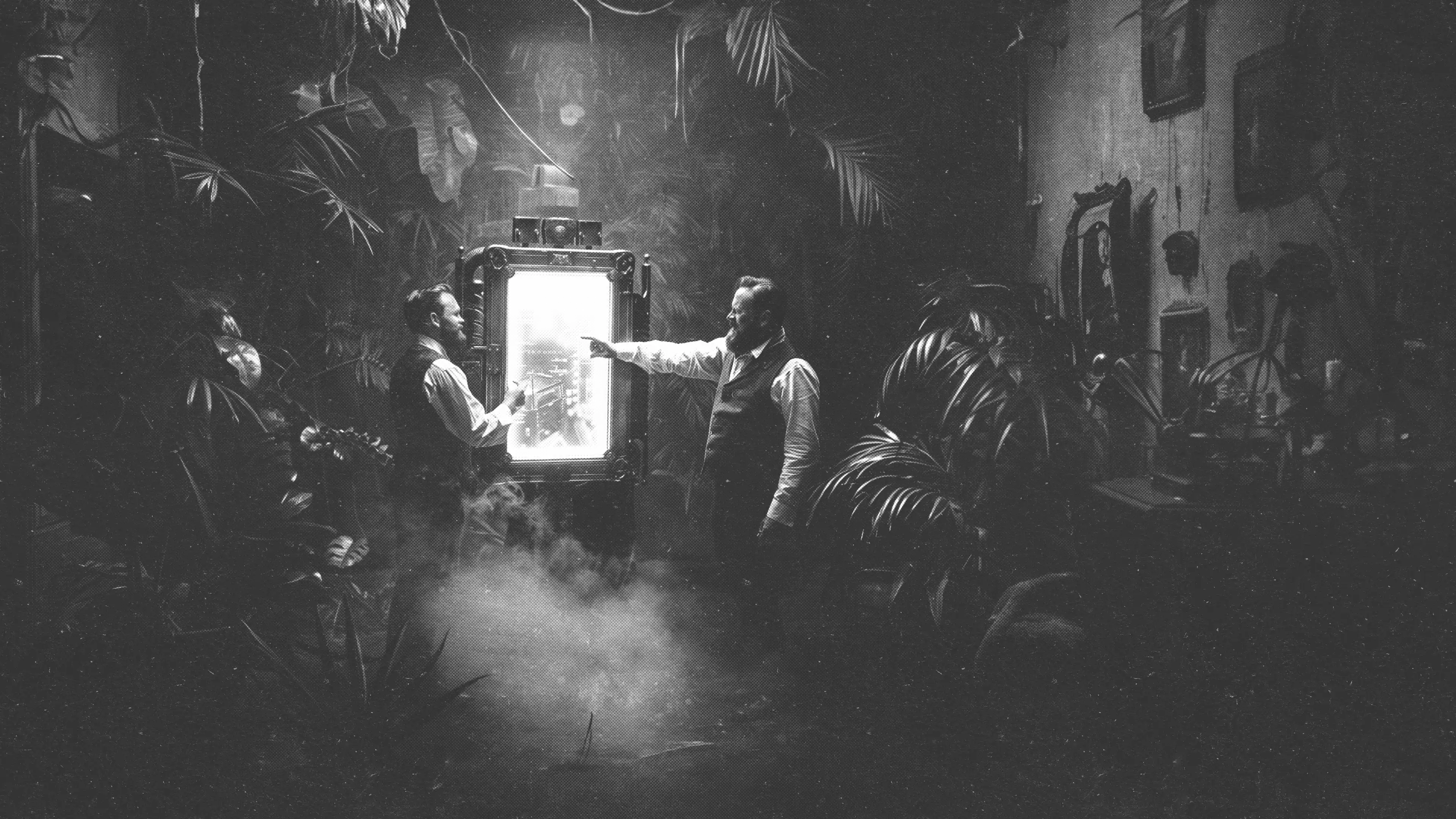
One of the proposed experiences was to be housed on three 85” portrait-oriented touch screens that stood 7’ tall. The content team requested a design for interactive image carousels that would allow visitors to explore high-resolution images of rare artifacts.
A Logical Pattern
So as not to confuse the visitor, the visual designer proposed a familiar side-to-side scrolling carousel similar to what one might find on a website. Affordance for navigation could be displayed as arrows on either side and reinforced by thumbnails underneath.
Larger Than Life
The displays were beautiful, but we struggled with the interactive pattern. For one thing, at close range and standing height, the upper quarter and bottom half of the screen were virtually unusable without crouching or craning your neck.
One Size Fits All
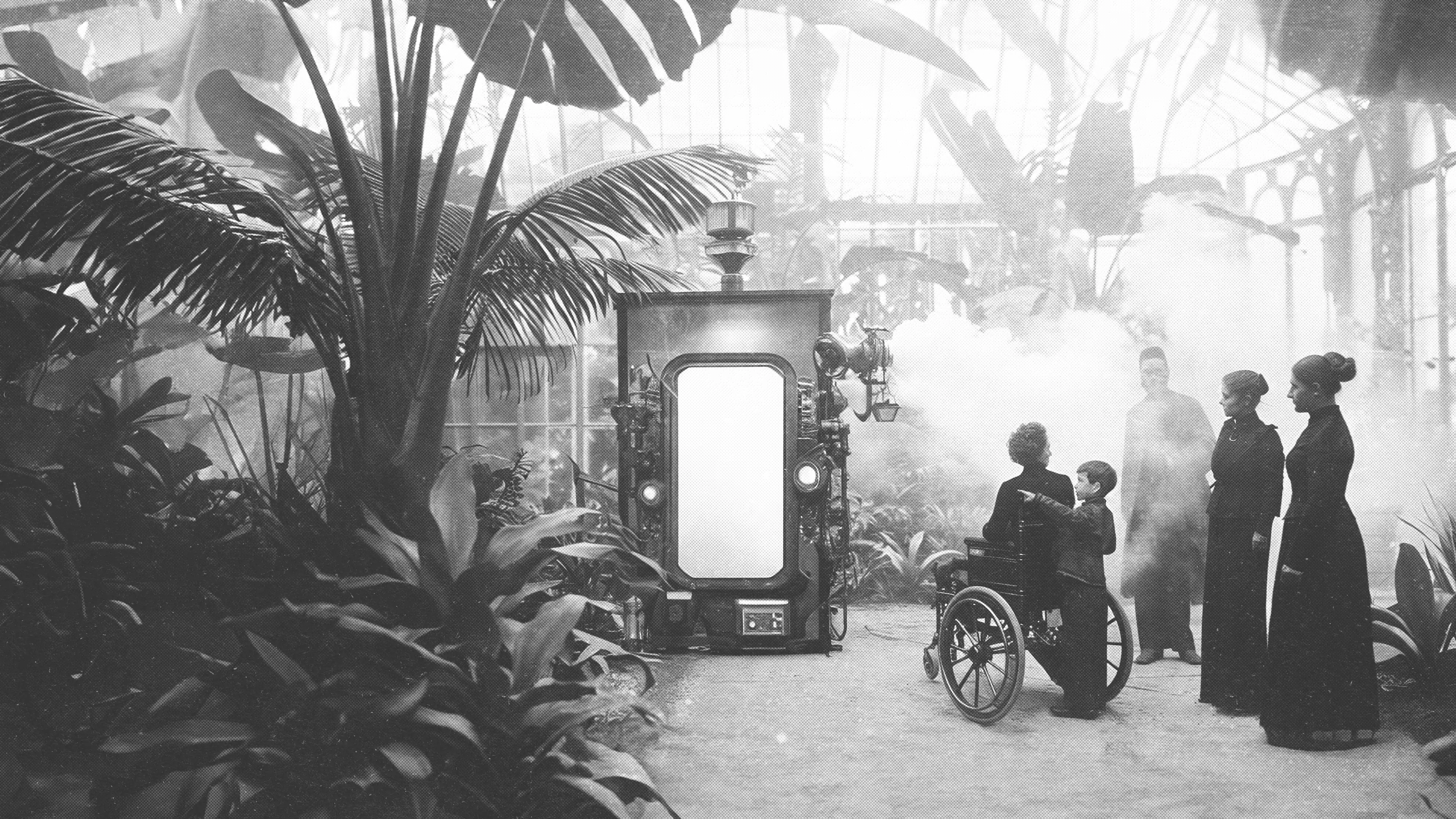
Additionally, while buttons and text at 5’ might be at a comfortable height for an adult male, they can be completely out of reach for a child or individual confined to a wheelchair. We attempted to solve this with an "accessibility button" that would lower the entire interface.

The Magic Button
The solution tested well, so as the museum launched, we felt we had addressed the issue. But as we observed real visitors, we noticed that many either missed the small button or were too embarrassed to use it and instead strained their bodies to the fixed narrow band of content.
Observing Real Guests
As we continued to observe the museum's guests we realized that the displays were closer to the mobile UIs we'd designed in the past which embrace a vertical navigation pattern. We started to imagine how we might flip our carousel so that content moved up and down the screen.
Refactoring the UI
As we refactored the UI we were more intentional about making affordance universal at all view heights as the content moved up the screen. We also abandoned borders on artifact detail views to embrace the full potential of these beautiful displays.
A Massive Success
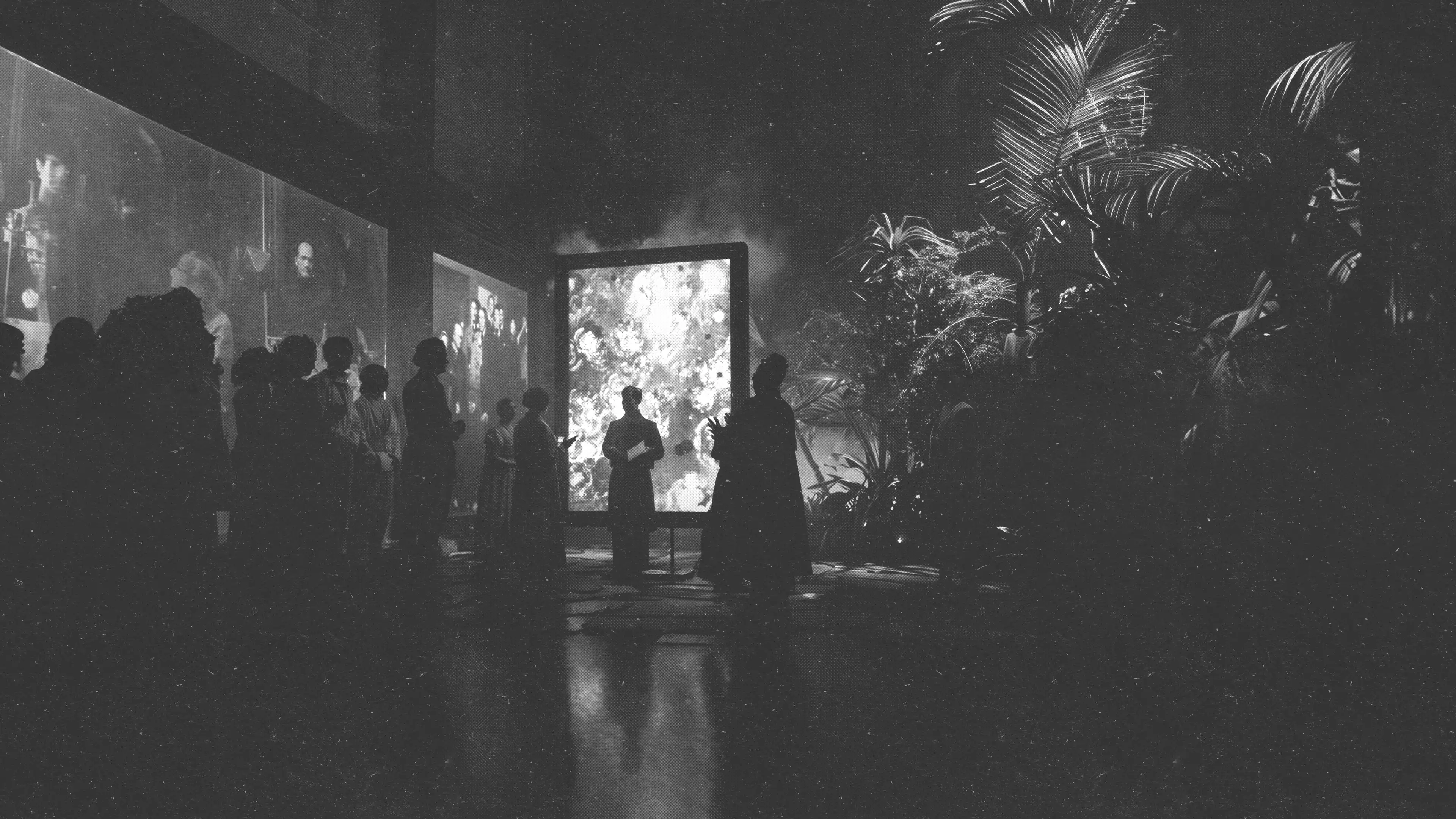
The new design pattern was a resounding success because there was no wrong way to approach the display. No one was punished or shamed for their height and the convention was implemented across other galleries in the museum and influenced future displays in museums to come.

The Role of Empathy
Of course, we wished we would have come to this realization sooner. But the team recognized that it was only by observing users en masse that their collective needs could really be understood. After all, empathy is what really drives good design.
Embracing Change
Today, we embrace the process of change, understanding that the value of an initial approach isn't lost on a better solution. The first attempt is a crucial stepping stone, paving the way for more refined and innovative ideas to emerge and enhance the overall experience.
Your Story Awaits
Do you have a well-intentioned design pattern with room for improvement? We're a team of passionate process innovators, product designers, and corporate storytellers who know from experience that we can accomplish more en masse.